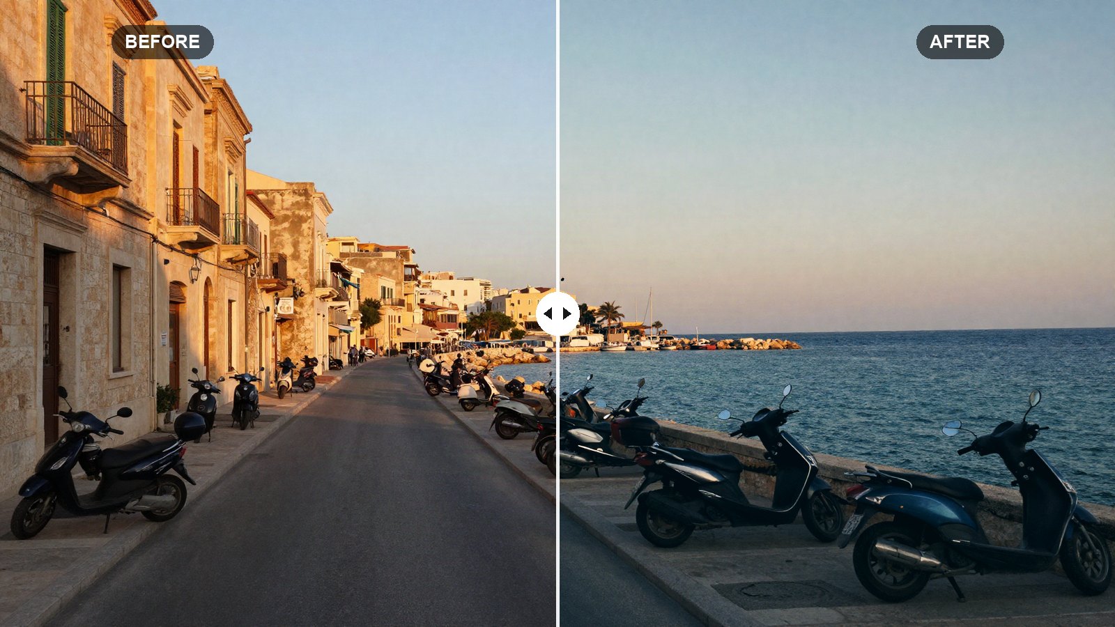
Orange and teal is the color scheme behind a huge number of film posters and travel photos. It works because the two colors sit roughly opposite each other on the color wheel: warm skin and sunlit surfaces pop forward, while cool shadows, water and sky fall back. Done well, it looks cinematic. Done badly, everyone looks sunburned and the sky turns a strange green.
Here are the orange and teal Lightroom settings we use as a starting point, with the reason behind every slider. They work in Lightroom Classic, Lightroom desktop and Lightroom mobile.
Quick answer: For orange and teal in Lightroom, add contrast (+20) with a gentle S-curve, pull Highlights (-40), shift Blue hue toward aqua (-35), push Green hue toward teal (+50) while desaturating it, move yellows toward orange, then use Color Grading to tint shadows teal (hue 195) and highlights orange (hue 38).
On this page
Prefer one click? Download the free preset file at the end of this post.
How the orange and teal look works
Most photos already contain warm and cool areas. Skin, brick, wood and sunlight are warm. Shadows, sky, water and glass are cool. The orange and teal look simply exaggerates that split and removes colors that do not fit, such as bright greens, purples and magentas.
That is why the recipe uses two tools together. The Color Mixer changes the hue of specific colors: blues move toward teal, greens move toward teal, yellows move toward orange. Color Grading then tints the tonal ranges: shadows get a teal cast and highlights get a warm one. Either tool alone gives a weaker version of the look.
The recipe suits city streets, travel shots, beaches, cars and portraits with blue sky or water behind the subject. It is less convincing on forest scenes, where a lot of green has to be turned into teal and can look unnatural.
Set white balance before the grade
White balance is not part of the recipe or the preset file. That is deliberate, since every photo starts from different light and a fixed Temp value would throw some shots too warm and others too cold. Set white balance per photo first, aiming for neutral. The grade adds the warm and cool tones, so if the base photo is already very warm, the result turns orange everywhere.
A good habit: get skin looking natural at neutral white balance, then apply the recipe. If skin looks too orange afterward, cool Temp by a few points rather than fighting the Color Mixer.
The orange and teal recipe: every setting
In Lightroom Classic, the first two tables are in the Basic panel. In Lightroom desktop and mobile, tone sliders are under Light, Texture, Clarity and Dehaze under Effects, and Vibrance and Saturation under Color.
Light (tone)
| Setting | Value | Why |
|---|---|---|
| Exposure | 0.00 | Left alone; set it per photo. |
| Contrast | +20 | Cinematic images have solid contrast. |
| Highlights | -40 | Keeps skies and skin highlights from burning out. |
| Shadows | +25 | Opens the shadows so the teal tint has something to color. |
| Whites | +10 | A little sparkle in the brightest areas. |
| Blacks | -20 | Deep, solid blacks like a film frame. |
Presence
| Setting | Value | Why |
|---|---|---|
| Texture | +8 | Crisp detail on buildings, cars and fabric. |
| Clarity | +10 | Adds midtone bite. |
| Dehaze | +8 | Deepens the sky and adds density. |
| Vibrance | +15 | Boosts the muted tones the grade relies on. |
| Saturation | -10 | Balances Vibrance so already-strong colors do not clip. |
Tone curve (point curve)
| Setting | Value | Why |
|---|---|---|
| Curve point 1 | Input 0 / Output 8 | A very slight lift so blacks are not dead flat. |
| Curve point 2 | Input 64 / Output 56 | Darkens the shadows, the bottom of the S-curve. |
| Curve point 3 | Input 128 / Output 128 | Anchors the midtones in place. |
| Curve point 4 | Input 192 / Output 200 | Brightens the light tones, the top of the S-curve. |
| Curve point 5 | Input 255 / Output 250 | Softens pure white just a little. |
In Lightroom Classic, open Tone Curve and switch to Point Curve. In Lightroom desktop and mobile, open Light, then Curve, and pick the white point-curve circle. Drag each point while watching the input and output numbers.
Color Mixer (HSL)
| Setting | Value | Why |
|---|---|---|
| Red (Hue / Sat / Lum) | +10 / 0 / 0 | Pulls reds toward orange so they join the warm side. |
| Orange (Hue / Sat / Lum) | 0 / +10 / +5 | Richer, slightly brighter skin and warm surfaces. |
| Yellow (Hue / Sat / Lum) | -30 / -20 / 0 | Moves yellows toward orange and calms them. |
| Green (Hue / Sat / Lum) | +50 / -60 / -20 | Pushes greens toward teal and mutes them hard. |
| Aqua (Hue / Sat / Lum) | 0 / +15 / -10 | Deeper, richer teal in water and glass. |
| Blue (Hue / Sat / Lum) | -35 / +10 / -10 | Shifts skies from blue toward teal and darkens them a little. |
| Purple (Hue / Sat / Lum) | 0 / -30 / 0 | Removes colors that do not belong in the palette. |
| Magenta (Hue / Sat / Lum) | 0 / -30 / 0 | Same as purple: fewer stray colors. |
In Classic this is the HSL/Color panel. In Lightroom desktop and mobile it is Color, then Color Mixer (the mobile button may say Mix).
Color Grading
| Setting | Value | Why |
|---|---|---|
| Shadows (Hue / Sat / Lum) | 195 / 22 / -5 | The teal half of the look, slightly darkened. |
| Midtones (Hue / Sat / Lum) | 0 / 0 / 0 | Left neutral so skin is not tinted twice. |
| Highlights (Hue / Sat / Lum) | 38 / 16 / 0 | The orange half: warm, golden highlights. |
| Global (Hue / Sat / Lum) | 0 / 0 / 0 | No overall tint. |
| Blending | 60 | A bit more overlap between the two tints for smoother transitions. |
| Balance | +5 | Tilts slightly toward the warm highlights. |
Color Grading is in its own panel in Lightroom Classic and under Color, then Grading, in Lightroom desktop and mobile. Our Color Grading panel guide explains what Blending and Balance do in more depth.
Effects
| Setting | Value | Why |
|---|---|---|
| Vignette Amount | -12 | A light frame that keeps attention in the center. |
| Vignette Midpoint | 50 | Default placement. |
| Vignette Feather | 50 | Default softness. |
No grain. This is a clean, modern cinematic grade. Add some yourself if you want a film-print feel.
Key takeaway: The Blue hue shift does most of the teal work. If your sky looks too green, move Blue Hue from -35 back toward -20. If it still looks too blue, go further, to around -45.
How to apply the recipe
- Open a well-exposed photo and reset it.
- Set a neutral white balance and check skin.
- Enter the Light and Presence values, then set Exposure for this photo.
- Build the five-point S-curve.
- Enter all eight Color Mixer rows.
- Set the Color Grading wheels, Blending and Balance.
- Add the vignette.
- Save it as a preset with White Balance unchecked.
Keeping skin tones natural
Skin is mostly orange, so this look always risks overcooking it. Three fixes, in order:
- Cool the white balance by 2 to 5 points of Temp. This often solves it on its own.
- Lower Orange Saturation from +10 to 0 or even -10.
- Reduce Highlights saturation in Color Grading from 16 to around 10.
For more control, mask the subject and lower saturation only on the person. Our Lightroom masking guide shows how to use Select Subject for this, and the HSL skin tones guide covers the Orange sliders in detail.
Common orange and teal mistakes
Too much shadow saturation. Past about 30, the teal starts to look like a filter instead of light. Keep it in the 15 to 25 range.
Ignoring greens. Leftover green grass or trees break the two-color palette. The strong Green shift in the recipe is there for a reason; lower Green Luminance further if trees still stand out.
Flat starting photos. The look needs light and shadow to work with. A photo taken in completely flat, gray light gives the grade nothing to separate.
Your next edit
Use these values as a base, set white balance and exposure for each frame, and watch skin closely. When you want warmth without the teal, try our golden hour Lightroom preset settings for a softer, sunlit glow.
FAQ
What are the best orange and teal Lightroom settings?
Start with Contrast +20, Highlights -40, a gentle S-curve, Blue Hue -35, Green Hue +50 with Green Saturation -60, then tint shadows teal (hue about 195) and highlights orange (hue about 38) in Color Grading.
Why does my orange and teal edit make skin look orange?
The starting white balance is usually too warm, or Orange Saturation is too high. Cool Temp a few points and lower Orange Saturation until skin looks natural.
Can I do orange and teal in Lightroom mobile?
Yes. The Color Mixer, Curve and Color Grading tools are all in Lightroom mobile, so you can enter every value by hand or import the preset file.
Is orange and teal the same as a cinematic preset?
It is one of the most common cinematic looks, but not the only one. Cinematic grades can also be cool and desaturated or warm and faded. Orange and teal is the high-contrast, two-color version.
Download the free preset
LRP Orange Teal as an .xmp file for Lightroom Classic, Lightroom desktop and Lightroom mobile. White balance is left out on purpose, so set it per photo.
Not sure how to add it? See desktop install or mobile install.
Keep reading
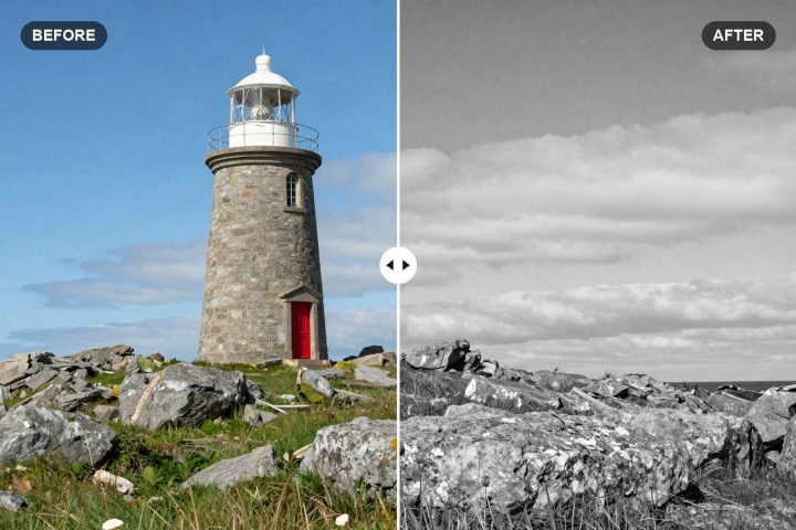
Black and White Lightroom Preset Settings: Rich B&W Recipe
Our rich black and white Lightroom recipe, with exact tone, curve and B&W Mix values that turn colors into strong, separated shades of gray.
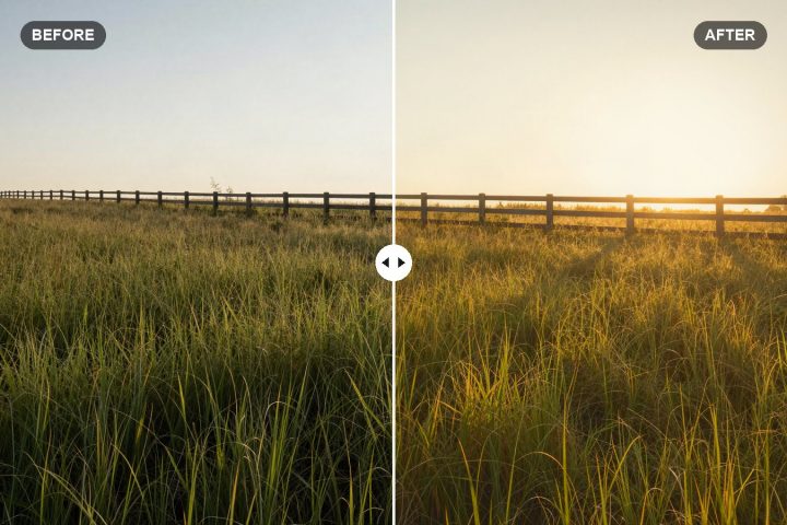
Golden Hour Lightroom Preset Settings for a Warm Glow
Exact Lightroom values for a soft, warm golden hour glow, with tips to boost real sunset light and add warmth to photos shot earlier in the day.
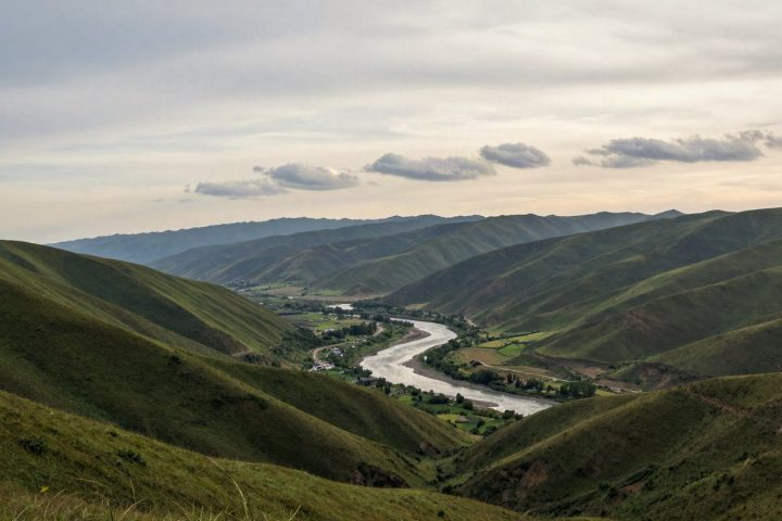
Edit Landscape Photos with Lightroom Presets: Skies and Greens
Apply a landscape preset, then fix what it can't: a washed-out sky, neon greens and flat haze, with starting values for each.