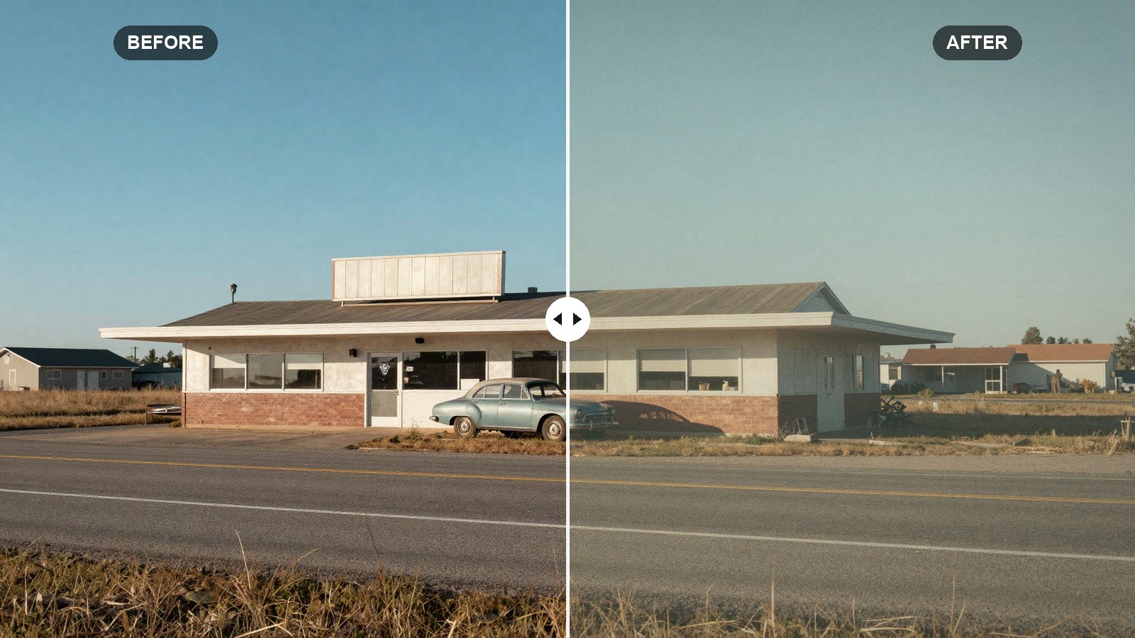
Old film prints have a look that digital files do not have out of the camera. The blacks are never quite black, the whites are a little creamy, blues lean toward cyan, greens drift toward olive, and there is a fine texture over everything. You cannot recreate a specific film stock exactly with sliders, but you can get very close to the feeling.
Below are the vintage film Lightroom preset settings we use as a base for a warm, faded, analog look. Every slider comes with a short reason, and the values work in Lightroom Classic, Lightroom desktop and Lightroom mobile.
Quick answer: For a vintage film look in Lightroom, fade the tone curve by lifting the black point to about 40 and lowering the white point to about 230, lower Contrast (-10) and Whites (-25), shift greens toward olive and desaturate blues, add warm Color Grading in the highlights, then add Grain (Amount 30, Size 30, Roughness 60) and a soft vignette.
On this page
Prefer one click? Download the free preset file at the end of this post.
What makes a photo look like vintage film
Four traits do most of the work:
- Faded tones. Prints and scans of older film rarely reach true black or pure white. Lifting the black point and lowering the white point on the curve is the single biggest step.
- Warm, slightly yellow color. Many consumer film stocks and aged prints lean warm. A light warm tint across the highlights and midtones gives that nostalgic cast.
- Shifted, muted colors. Greens go olive, blues turn a softer cyan, and nothing is very saturated.
- Grain. Film has visible texture. Lightroom’s Grain tool adds a convincing version if you keep it moderate.
The recipe looks best on everyday subjects: street scenes, road trips, family photos, beaches, old cars and buildings. It is less suited to product photos or anything where accurate color matters.
Before you apply: white balance and the profile
White balance is left out of the recipe and the preset file on purpose. A vintage look depends on a warm cast, but how much warmth a photo needs depends entirely on the light it was shot in. Set white balance per photo, then push Temp a few points warmer than neutral if you want a stronger yellowed-print feel.
The profile matters too. Start from Adobe Color or Adobe Standard rather than a vivid or high-contrast profile, since the faded curve needs a fairly neutral base. Our article on presets vs profiles explains how the two interact.
The vintage film recipe: every setting
In Lightroom Classic, the tone and presence sliders are in the Basic panel. In Lightroom desktop and mobile, tone sliders are under Light, Texture, Clarity and Dehaze are under Effects, and Vibrance and Saturation are under Color.
Light (tone)
| Setting | Value | Why |
|---|---|---|
| Exposure | +0.10 | Small lift to offset the darkening from the lowered white point. |
| Contrast | -10 | Softer, gentler tonal transitions, like a print. |
| Highlights | -35 | Keeps detail in skies and bright walls. |
| Shadows | +20 | Opens dark areas for the faded feel. |
| Whites | -25 | Pulls the brightest tones toward cream. |
| Blacks | +10 | Adds to the curve’s lift for washed-out blacks. |
Presence
| Setting | Value | Why |
|---|---|---|
| Texture | 0 | Left alone; grain supplies the texture. |
| Clarity | -5 | A slight softness, like an older lens. |
| Dehaze | -8 | Adds a little haze and lowers local contrast. |
| Vibrance | -10 | Calms the most saturated colors first. |
| Saturation | -5 | A light overall mute. |
Tone curve (point curve)
| Setting | Value | Why |
|---|---|---|
| Curve point 1 | Input 0 / Output 40 | The main fade: black becomes a soft dark gray. |
| Curve point 2 | Input 70 / Output 80 | Keeps the shadows lifted but still darker than the midtones. |
| Curve point 3 | Input 128 / Output 130 | Midtones almost unchanged. |
| Curve point 4 | Input 200 / Output 195 | Starts rolling off the light tones. |
| Curve point 5 | Input 255 / Output 230 | Creamy, slightly dull whites like an aged print. |
In Lightroom Classic, open Tone Curve and switch to Point Curve. In Lightroom desktop and mobile, go to Light, then Curve, and select the white point-curve circle. Drag each point while watching the input and output readout. A few numbers off is fine.
Color Mixer (HSL)
| Setting | Value | Why |
|---|---|---|
| Red (Hue / Sat / Lum) | +8 / -10 / 0 | Slightly orange, less intense reds. |
| Orange (Hue / Sat / Lum) | +5 / -5 / +5 | Golden, gently brightened skin. |
| Yellow (Hue / Sat / Lum) | -10 / -15 / 0 | Warmer, quieter yellows. |
| Green (Hue / Sat / Lum) | -35 / -35 / -10 | Moves greens toward olive, a classic film trait. |
| Aqua (Hue / Sat / Lum) | 0 / -40 / 0 | Mutes water and pool colors. |
| Blue (Hue / Sat / Lum) | -20 / -40 / +5 | Pale cyan-leaning skies instead of deep digital blue. |
| Purple (Hue / Sat / Lum) | 0 / -30 / 0 | Removes modern-looking purples. |
| Magenta (Hue / Sat / Lum) | 0 / -25 / 0 | Softens pinks. |
In Classic this is the HSL/Color panel. In Lightroom desktop and mobile it is Color, then Color Mixer (the button may read Mix on mobile).
Color Grading
| Setting | Value | Why |
|---|---|---|
| Shadows (Hue / Sat / Lum) | 170 / 10 / 0 | A faint cyan-green in the shadows, common in scanned film. |
| Midtones (Hue / Sat / Lum) | 40 / 6 / 0 | Light warmth through the middle tones. |
| Highlights (Hue / Sat / Lum) | 50 / 15 / 0 | Yellow-gold highlights, the aged-print warmth. |
| Global (Hue / Sat / Lum) | 45 / 4 / 0 | A very light warm wash over everything. |
| Blending | 50 | Default blend between the tones. |
| Balance | +10 | Favors the warm highlights slightly. |
Effects
| Setting | Value | Why |
|---|---|---|
| Grain Amount | 30 | Visible but not distracting at normal viewing size. |
| Grain Size | 30 | Slightly larger than default for a film-like clump. |
| Grain Roughness | 60 | Less even, more organic grain. |
| Vignette Amount | -20 | Darker corners, like older lenses. |
| Vignette Midpoint | 40 | The darkening starts a little closer to the center. |
| Vignette Feather | 70 | Very soft fall-off so it reads as lens character. |
Tip: Judge grain at 100% zoom and at the size people will see the photo. Grain that looks heavy at 100% often disappears on a phone screen, and Instagram compression softens it further. If it vanishes on your phone, raise Amount to 40.
How to apply the recipe
- Open a photo and reset it, then choose Adobe Color as the profile.
- Set white balance, then warm it slightly if you like.
- Enter the Light and Presence values.
- Build the faded five-point curve.
- Enter all eight Color Mixer rows.
- Set all four Color Grading wheels, Blending and Balance.
- Add grain and vignette in Effects.
- Save as a preset with White Balance unchecked.
If you would rather install the ready-made file, our guide to installing Lightroom presets on desktop covers XMP and ZIP files.
Adapting the vintage look to your photo
- Too washed out: drag curve point 1 down from 40 to around 25. This is the strongest single control for how faded the photo looks.
- Too yellow: lower Highlights saturation in Color Grading from 15 to 8, and set Global saturation to 0.
- Skin looks sallow: lower Orange Hue from +5 to 0 and cool white balance a few points.
- Noisy phone photo: lower Grain Amount to 20, since grain on top of noise looks messy. Shooting RAW helps a lot here; see RAW vs JPEG for presets.
Common vintage film mistakes
Fading too much. A black point above about 50 makes most photos look foggy rather than vintage. Keep some depth.
Heavy grain on small files. On low-resolution images, large grain looks like digital noise. Lower Size on small files.
Over-warming. Old film is warm, not orange. If white objects look clearly yellow, back off the grading.
Your next edit
Start from these values, set white balance and exposure on every photo, and tune the black point to taste. When you want a timeless look with no color at all, try our rich black and white Lightroom preset settings.
FAQ
How do I make photos look like vintage film in Lightroom?
Lift the black point and lower the white point on the tone curve, mute and shift colors (greens toward olive, blues toward cyan), add warm Color Grading in the highlights, then add moderate grain and a soft vignette.
What grain settings look like real film?
A good starting point is Amount 25 to 35, Size around 30 and Roughness around 60. Check the result at the size your photo will be viewed, not only zoomed in.
Why are my faded blacks gray instead of soft?
The black point on the curve is lifted too high for that photo. Lower curve point 1 a little until the shadows have some weight again.
Does this recipe copy a specific film stock?
No. It is a general warm, faded film look rather than a copy of any one stock. Treat it as a base and adjust it toward the look you like.
Download the free preset
LRP Vintage Film as an .xmp file for Lightroom Classic, Lightroom desktop and Lightroom mobile. White balance is left out on purpose, so set it per photo.
Not sure how to add it? See desktop install or mobile install.
Keep reading
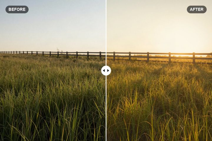
Golden Hour Lightroom Preset Settings for a Warm Glow
Exact Lightroom values for a soft, warm golden hour glow, with tips to boost real sunset light and add warmth to photos shot earlier in the day.
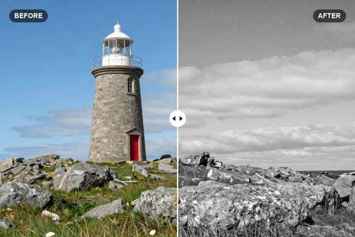
Black and White Lightroom Preset Settings: Rich B&W Recipe
Our rich black and white Lightroom recipe, with exact tone, curve and B&W Mix values that turn colors into strong, separated shades of gray.
Edit Portraits With Lightroom Presets and Keep Skin Natural
Keep skin natural when you use presets on portraits: white balance, Orange in HSL, People masks, gentle softening and a quieter background.