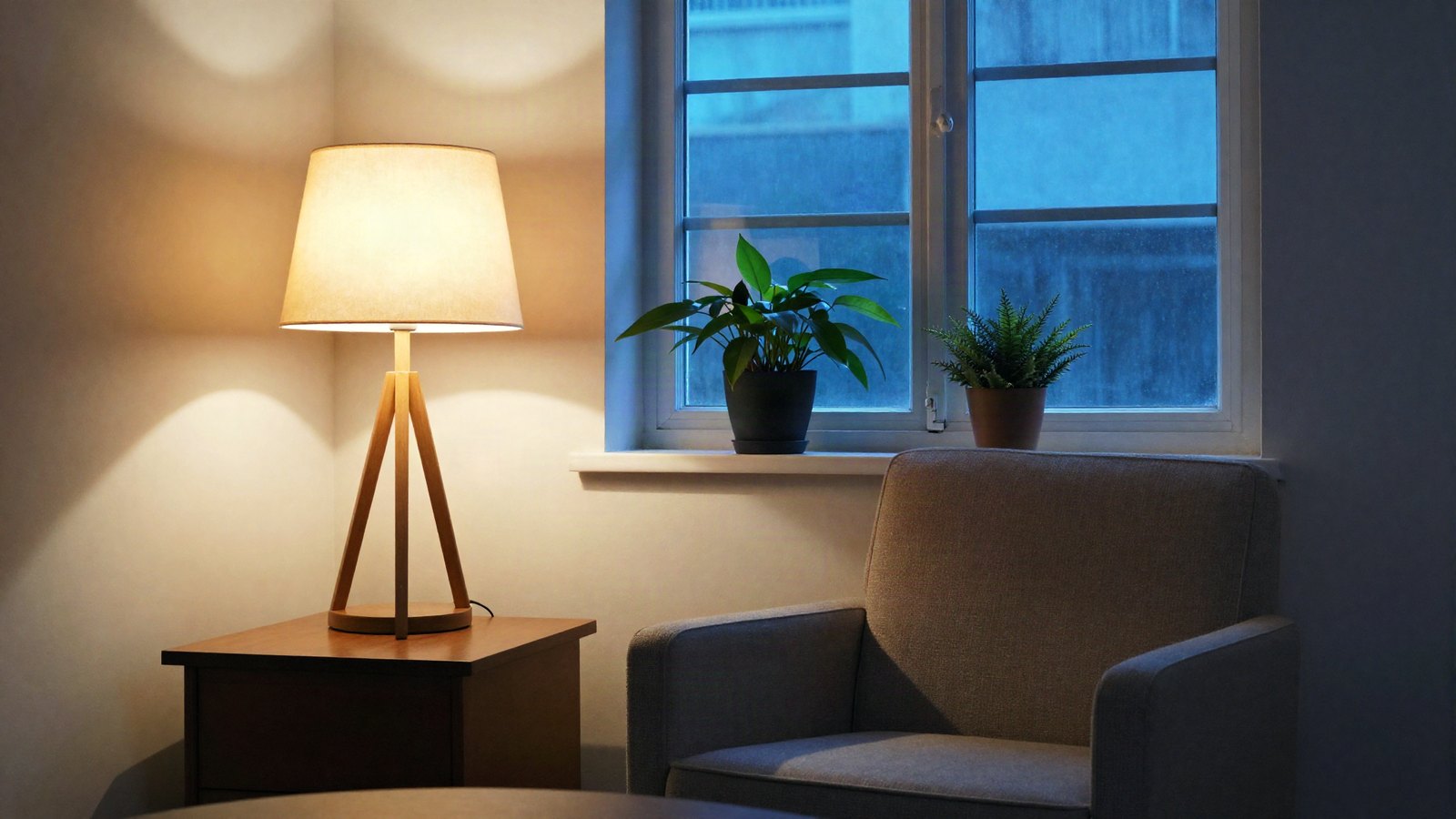
The preview looked perfect. Soft creams, gentle shadows, skin that glowed. You clicked the same preset on your own photo and got something orange, flat or strangely dark. It is the most common complaint we hear about presets, and it is not because you bought a bad pack.
This post explains why Lightroom presets look different on every photo, and the six adjustments that bring almost any preset back in line in under a minute.
Quick answer: Presets look different because each photo starts with different light color, brightness, contrast and colors in the scene. A preset only moves sliders by fixed amounts, so it cannot adapt. Fix it by adjusting white balance, exposure, highlights and whites, shadows and blacks, the preset Amount, and any problem color in HSL.
On this page
Why Lightroom presets look different on every photo
A preset is a list of slider values, nothing more. It does not look at your photo and decide what it needs. It says “Highlights -60, Blacks +20, Orange saturation -10” and applies those numbers to whatever is on screen. If your starting point differs from the photo the preset was built on, the result differs too. Here are the usual reasons.
1. The color of the light
Daylight, shade, sunset, tungsten bulbs and phone flashes all have different color temperatures. A preset built on a warm golden-hour beach photo might add even more warmth. Apply that to an indoor shot under yellow bulbs and you get orange skin. This is the single biggest cause of preset mismatch.
2. Exposure and dynamic range
A preset designed on a bright, airy photo often lifts shadows and pulls highlights. On an already bright photo, that can wash everything out. On a dark photo, the same values can turn shadows muddy and gray.
3. RAW vs JPEG
A raw file gives Lightroom the full sensor data to work with. A JPEG or HEIC has already been processed by your camera or phone, with its own contrast, sharpening and color choices baked in. Presets are usually built on raw files, so the same values hit a JPEG much harder. Our guide to RAW vs JPEG for presets goes deeper on this.
4. Camera and profile differences
Different cameras render colors differently, and a preset may switch your profile when you apply it. A Canon file and a Sony file run through the same preset will not match exactly, and a phone file is different again.
5. The colors in the scene
Presets often shift specific hues: greens toward yellow, blues toward teal, oranges a little lighter for skin. On a forest portrait, those changes are obvious. On a gray city street, almost nothing happens. Same preset, completely different visible effect.
6. Settings the preset does not touch
A preset only changes the settings saved in it. If your photo already had edits, like Clarity +40 or a heavy crop vignette, they stay and mix with the preset’s look.
The 6 adjustments that fix most presets
Work through these in order after applying a preset. Most photos only need the first two or three. The panel names below are for Lightroom Classic first, then Lightroom desktop and mobile.
| Adjustment | Where to find it | What it fixes |
|---|---|---|
| 1. White balance (Temp, Tint) | Basic panel / Color panel | Orange, blue, green or magenta casts |
| 2. Exposure | Basic panel / Light panel | Overall too bright or too dark |
| 3. Highlights and Whites | Basic panel / Light panel | Blown skies, glaring skin |
| 4. Shadows and Blacks | Basic panel / Light panel | Muddy or washed-out shadows |
| 5. Preset Amount | Presets panel | A look that is simply too strong |
| 6. HSL / Color Mixer | HSL/Color panel / Color panel, Color Mixer | One color that went wrong, often skin |
Fix 1: White balance
Start here, every time. Move the Temp slider until whites look white and skin looks like skin, then use Tint to remove any green or magenta. On raw files, Temp is shown in kelvin; on JPEGs it is a -100 to +100 scale.
The fastest method is the eyedropper (White Balance Selector) next to the WB controls. Click it, then click something that should be neutral gray or white, like a shirt, a wall or a cloud. Then fine-tune by eye if you want the photo warmer or cooler than true neutral.
Fix 2: Exposure
Set overall brightness with Exposure, which runs from -5 to +5. Most corrections after a preset fall between -0.7 and +0.7. Judge it by the subject, not the whole frame. A face should look naturally lit, even if the background ends up a little bright or dark.
Fix 3: Highlights and Whites
If the sky or bright skin is glaring, lower Highlights first, then Whites. Hold Alt (Windows) or Option (Mac) while dragging Whites in Lightroom Classic or Lightroom desktop to see clipping: anything that shows as solid color or white is losing detail.
Fix 4: Shadows and Blacks
Matte and faded presets lift the blacks on purpose, which can look gray on a photo that was already low in contrast. Pull Blacks down by 5 to 15 to bring back depth, then adjust Shadows to taste. If shadows are too dark instead, raise Shadows before touching Exposure.
Fix 5: The preset Amount
Recent versions of Lightroom Classic, Lightroom desktop and Lightroom mobile show an Amount slider for presets after you apply one. Dropping it to 60 or 70 often solves a look that is just too heavy, without touching anything else. If you use creative profiles, they have their own Amount slider too. Our guide to presets vs profiles explains how the two differ.
Fix 6: One problem color
Sometimes the whole photo looks good except one thing: orange skin, neon green grass, a sky that went purple. Open the HSL/Color panel in Classic or the Color Mixer inside the Color panel in Lightroom desktop and mobile (labeled Mix in some versions). Use the targeted adjustment tool or pick the color directly, then nudge its Saturation and Luminance. For skin, Orange Saturation -5 to -15 and Orange Luminance +5 to +10 is a common starting point. Our guide to HSL for natural skin tones has more detail.
Key takeaway: Fix white balance and exposure first, always in that order. Many “bad” presets are fine once those two match the photo, and adjusting anything else before them just means doing it twice.
Prevent the problem before it starts
You cannot make one preset fit every photo perfectly, but you can make it fit far more of them.
- Shoot raw when you can. More data means presets respond more predictably, and white balance changes are cleaner.
- Get exposure close in camera. A preset applied to a well-exposed photo needs fewer fixes.
- Choose presets built for your light. A preset made for sunny beaches will fight indoor photos. Keep a few presets per lighting type rather than one for everything.
- Remove white balance and exposure from presets you make. Untick both when you save a preset, so it changes the style and leaves per-photo corrections to you.
- Edit similar photos together. Photos from the same scene and light can share one set of corrections. Fix one, then copy its settings to the rest.
A fast routine for every photo
Once you know the six fixes, a preset edit takes well under a minute:
- Apply the preset.
- Set white balance with the eyedropper, then adjust by eye.
- Adjust Exposure for the subject.
- Check Highlights, Whites, Shadows and Blacks.
- Lower the preset Amount if the look is still too strong.
- Fix any single problem color in HSL.
If you are working through a whole shoot, do this on one representative photo, then sync the corrections to similar frames rather than repeating them by hand.
Your next edit
Pick a preset you thought did not work and run it through the routine above on three different photos. Most of the time, the “bad” preset just needed white balance and exposure to match. Once a single photo looks right, apply the same fixes to the rest of the set with our guide to batch editing photos in Lightroom.
FAQ
Why does my preset look orange on my photos?
Usually because your photo was taken in warmer light than the preset’s sample, or the preset adds warmth that stacks on top. Lower the Temp slider until skin and whites look natural, and reduce Orange saturation in HSL if skin is still too strong.
Why do presets look worse on phone photos?
Phone JPEGs and HEICs are already processed, with contrast, sharpening and color applied, so a preset built for raw files pushes them further than intended. Lower the Amount, or shoot in your phone’s raw format if it has one.
Is a preset that needs adjusting a bad preset?
No. Every preset needs some adjustment because every photo starts differently. A good preset gets you most of the way with only white balance and exposure tweaks. If it needs heavy work on every photo, it was built for different light.
Should I adjust before or after applying the preset?
After. If the preset includes white balance or exposure, it will overwrite any corrections you made first. Apply the preset, then make your fixes.
Keep reading
Lightroom Lens Blur Guide: Natural Background Blur
Add believable background blur in Lightroom: Blur Amount, bokeh shapes, Focal Range and refining the AI depth map.
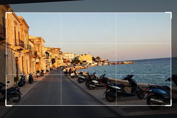
Lightroom Crop and Straighten Guide: Ratios, Upright, Guided
Level horizons, pick the right aspect ratio and fix leaning buildings with Upright and Guided Upright in Lightroom.
How to Create Your Own Lightroom Preset (Step by Step)
Save your own Lightroom presets, choose the right settings to include, and keep a growing collection organized and backed up.