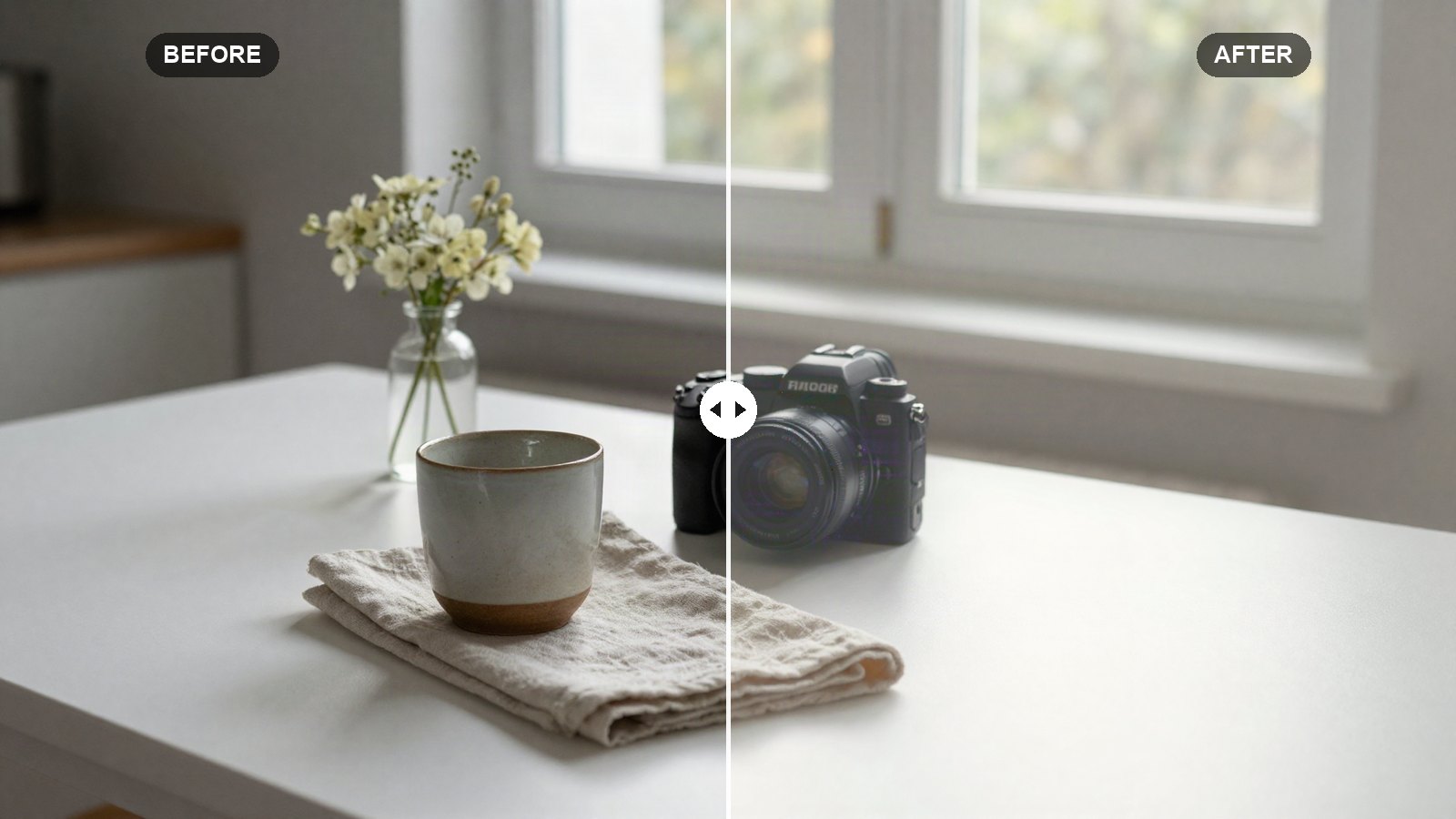
Bright and airy is the look of wedding blogs, lifestyle feeds and food photos shot next to a big window. It feels clean and soft: white walls stay white, shadows never get heavy, and colors look like they were mixed with a little milk. It is also one of the easiest looks to overdo, because pushing Exposure alone just blows out the highlights and leaves everything flat.
This post gives you the bright and airy Lightroom preset settings we use as a base, with a reason for every slider. The values work in Lightroom Classic, Lightroom desktop and Lightroom mobile.
Quick answer: For a bright and airy look, raise Exposure about +0.35, lower Contrast (-20), lift Shadows (+45) and Blacks (+15), raise Whites (+20) while pulling Highlights (-30), soften Clarity (-10), lighten and desaturate greens, yellows and blues in the Color Mixer, and use a lifted point curve with a faint warm highlight tint.
On this page
Prefer one click? Download the free preset file at the end of this post.
What makes a photo bright and airy
The look is about light, not just brightness. A bright and airy photo has open shadows, so you can see into every corner, and clean whites that are bright without losing their detail. Contrast is low, so the image feels gentle rather than punchy.
Color does the rest. Greens and yellows, which often look harsh in daylight, get lighter and less saturated. Blues shift slightly toward aqua and become pale. Skin keeps its warmth but gets a little brighter. The result is a pastel palette that holds together across very different photos.
This recipe works best on photos taken in soft, even light: window light indoors, open shade, overcast days and beaches. It struggles with very dark scenes, night shots and photos with a bright sky behind a dark subject, where you would need to lift the subject so much that noise appears.
White balance and exposure come first
White balance is not in the recipe or the preset file, on purpose. A bright and airy look depends on clean, neutral whites, and the right Temp and Tint values change with every lighting situation. Set white balance per photo before anything else. Use the White Balance Selector (the eyedropper) on something that should be neutral, like a white wall or a gray shirt, then warm it by a few points if you like a cozier feel.
Watch for a green tint indoors. Window light bouncing off plants or painted walls can add a green cast, and the airy look makes it more obvious. Moving Tint a few points toward magenta usually fixes it.
Exposure matters more here than in most recipes. The values assume a normally exposed photo. If yours was already bright, the +0.35 Exposure plus the lifted curve may push the whites too far, so lower Exposure afterward. Our post on why presets look different on every photo walks through this check.
The bright and airy recipe: every setting
In Lightroom Classic, the tone and presence values are in the Basic panel. In Lightroom desktop and mobile, tone sliders sit under Light, Texture, Clarity and Dehaze under Effects, and Vibrance and Saturation under Color.
Light (tone)
| Setting | Value | Why |
|---|---|---|
| Exposure | +0.35 | Brightens the whole frame by about a third of a stop. |
| Contrast | -20 | Softens the image so it feels gentle, not punchy. |
| Highlights | -30 | Protects bright areas like windows and white fabric. |
| Shadows | +45 | Opens dark areas so nothing feels heavy. |
| Whites | +20 | Sets a clean, bright white point. |
| Blacks | +15 | Lifts the darkest tones for a soft, low-contrast base. |
Presence
| Setting | Value | Why |
|---|---|---|
| Texture | -5 | Smooths skin and surfaces very slightly. |
| Clarity | -10 | Adds a soft, light glow to the midtones. |
| Dehaze | -5 | A touch of haze for an airy, sunlit feel. |
| Vibrance | +10 | Keeps muted colors from looking lifeless. |
| Saturation | -8 | Pulls back the strongest colors toward pastel. |
Tone curve (point curve)
| Setting | Value | Why |
|---|---|---|
| Curve point 1 | Input 0 / Output 15 | Lifts pure black so shadows look soft. |
| Curve point 2 | Input 64 / Output 74 | Brightens the dark tones. |
| Curve point 3 | Input 128 / Output 140 | Raises the midtones, where most of the brightness comes from. |
| Curve point 4 | Input 192 / Output 202 | Lifts the light tones gently. |
| Curve point 5 | Input 255 / Output 255 | Leaves pure white untouched so whites stay clean. |
In Lightroom Classic, open Tone Curve and switch to the Point Curve. In Lightroom desktop and mobile, go to Light, then Curve, and choose the white point-curve circle. Click to add points and drag while watching the input and output readout. Within two or three numbers is close enough.
Color Mixer (HSL)
| Setting | Value | Why |
|---|---|---|
| Red (Hue / Sat / Lum) | +5 / -10 / +5 | Softens strong reds and nudges them toward coral. |
| Orange (Hue / Sat / Lum) | -3 / -8 / +12 | Brightens skin and keeps it from looking orange. |
| Yellow (Hue / Sat / Lum) | -15 / -30 / +15 | Turns harsh yellows into soft, warm cream. |
| Green (Hue / Sat / Lum) | -20 / -40 / +15 | Makes foliage lighter, softer and slightly yellower. |
| Aqua (Hue / Sat / Lum) | -10 / -30 / +20 | Pale, gentle water and pool tones. |
| Blue (Hue / Sat / Lum) | -15 / -25 / +20 | Shifts skies toward aqua and makes them pale. |
| Purple (Hue / Sat / Lum) | 0 / -20 / 0 | Removes purple casts in shadows. |
| Magenta (Hue / Sat / Lum) | 0 / -15 / 0 | Keeps pink flowers soft instead of neon. |
In Classic this is the HSL/Color panel. In Lightroom desktop and mobile it is Color, then Color Mixer (on mobile the button may read Mix). If skin is the main subject, our guide to natural skin tones with HSL explains the Orange sliders in detail.
Color Grading
| Setting | Value | Why |
|---|---|---|
| Shadows (Hue / Sat / Lum) | 220 / 4 / 0 | A barely visible cool tint that keeps shadows clean. |
| Midtones (Hue / Sat / Lum) | 0 / 0 / 0 | Left neutral. |
| Highlights (Hue / Sat / Lum) | 45 / 6 / 0 | A soft creamy warmth in the bright areas. |
| Global (Hue / Sat / Lum) | 0 / 0 / 0 | No overall tint. |
| Blending | 70 | Spreads the tints smoothly so they never band. |
| Balance | +20 | Lets the warm highlight tint cover more of the frame. |
Effects
No vignette and no grain. Darkened corners work against the open, light feel, and grain adds texture this look does not need. If your lens already vignettes, turn on Enable Profile Corrections (Use Profile Corrections in some versions) in Lens Corrections (Optics in Lightroom desktop and mobile) to brighten the corners evenly.
Tip: Airy does not mean clipped. In Lightroom Classic, hold Alt (Option on Mac) while dragging Whites to see which areas turn pure white. A few specular highlights are fine; a whole white wall flashing on the clipping view is not.
How to apply the recipe
- Open a well-exposed photo and reset it.
- Set white balance with the eyedropper on something neutral, then fine-tune Temp and Tint.
- Enter the Light and Presence values.
- Build the five-point curve.
- Enter all eight Color Mixer rows.
- Set the Color Grading wheels, Blending and Balance.
- Check the whites for clipping and lower Exposure or Whites if needed.
- Save it as a preset with White Balance unchecked so it stays flexible.
Adapting the bright and airy look
- Looks washed out: raise Contrast from -20 to -10, or lower Blacks from +15 to +5. Airy should still have some structure.
- Whites are blown: lower Exposure by 0.1 to 0.2 and Whites to +10. Leave Shadows high.
- Skin looks pale or gray: raise Orange Saturation from -8 to 0 and add a few points of warmth to Temp.
- Grass looks neon: lower Green Saturation further, to around -55.
- Outdoor sun: lower Shadows to +30 and Highlights to -50, since direct sun already has plenty of light.
If you post a series, consistency matters more than any single slider. Apply the preset to the whole set, then match exposure and white balance photo by photo. Our guide to a consistent Instagram feed in Lightroom covers that workflow.
Common bright and airy mistakes
Using Exposure for everything. Exposure brightens highlights as much as shadows, so it blows out windows fast. Let Shadows, Blacks and the curve do most of the lifting.
Too much negative Clarity. Past about -20, faces and fabrics start to look smeared. Keep it subtle.
Ignoring color casts. Brightening amplifies any tint in the photo. Fix white balance first, every time.
Your next edit
Start with these values, set white balance per photo and keep an eye on your whites. When you want the opposite mood for darker, more dramatic subjects, try our moody dark Lightroom preset settings, which use many of the same sliders in the other direction.
FAQ
What settings make a photo bright and airy in Lightroom?
Raise Exposure slightly, lower Contrast, lift Shadows and Blacks, raise Whites while pulling Highlights down, and lighten and desaturate greens, yellows and blues in the Color Mixer. A lifted point curve and a soft warm highlight tint finish the look.
Why do my bright and airy photos look washed out?
Usually the blacks are lifted too much or contrast is too low for that photo. Bring Blacks back toward 0 or raise Contrast by about 10 points to restore some depth without losing the light feel.
Is bright and airy good for dark photos?
Not really. Brightening a very dark photo this much reveals noise and flattens the image. The look works best on photos shot in soft, plentiful light.
Why does the preset not include white balance?
Each photo is shot under different light. Leaving white balance out lets you set clean, neutral whites on every image while keeping the rest of the look the same.
Download the free preset
LRP Bright Airy as an .xmp file for Lightroom Classic, Lightroom desktop and Lightroom mobile. White balance is left out on purpose, so set it per photo.
Not sure how to add it? See desktop install or mobile install.
Keep reading
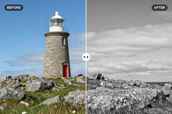
Black and White Lightroom Preset Settings: Rich B&W Recipe
Our rich black and white Lightroom recipe, with exact tone, curve and B&W Mix values that turn colors into strong, separated shades of gray.
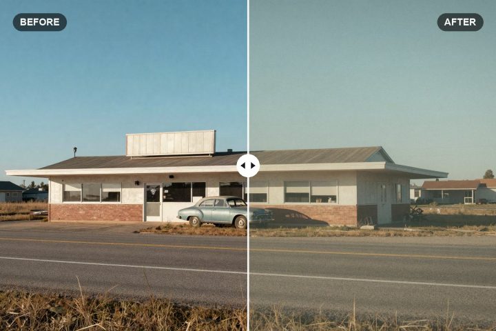
Vintage Film Lightroom Preset Settings: Faded Warm Recipe
Faded blacks, warm highlights, muted blues and real grain: the exact Lightroom values we use for a warm vintage film look, explained slider by slider.
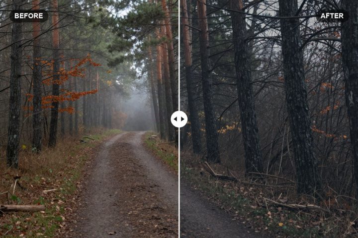
Moody Lightroom Preset Settings: Dark Recipe to Copy
Exact slider values for a dark, muted, moody look in Lightroom, with the reasoning behind each setting and how to adapt it to your own photos.