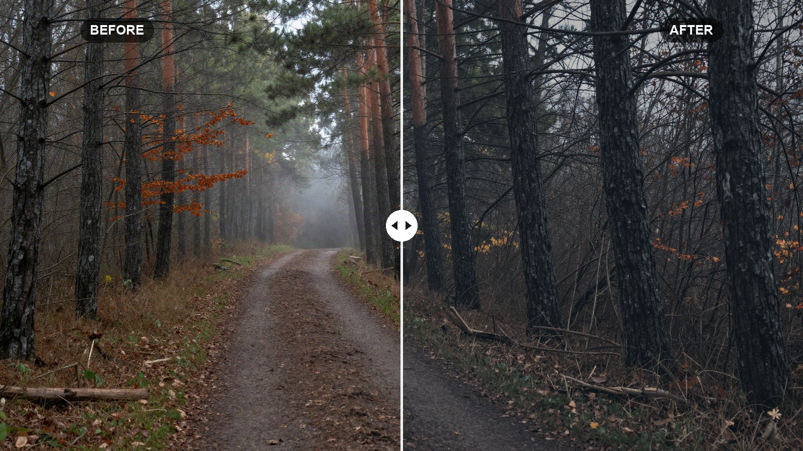
A moody edit is not just a dark edit. Pull Exposure down on a flat, gray photo and you get a flat, gray photo that is harder to see. The look people mean when they say “moody” comes from a few specific choices: highlights held back, blacks that are deep but not crushed, greens and blues pushed toward muted tones, and a hint of cool color in the shadows.
Below are the exact moody Lightroom preset settings we use as a starting point, slider by slider, with a short reason for each one. You can copy them by hand in a couple of minutes, and they work in Lightroom Classic, Lightroom desktop and Lightroom mobile.
Quick answer: For a moody look in Lightroom, lower Exposure slightly (around -0.4), pull Highlights hard (-65) and Whites down (-20), lift Shadows a little (+15), cut Saturation (-12), desaturate and darken greens and blues in the Color Mixer, add a faded point curve, a cool blue tint to the shadows in Color Grading, and a soft vignette.
On this page
Prefer one click? Download the free preset file at the end of this post.
What makes a photo look moody
Moody photos feel quiet and heavy. The eye goes to a few lit areas while the rest of the frame falls into soft shadow. Color plays a big part: bright greens and saturated blue skies fight the mood, so a moody edit tones them down and darkens them, while warm tones such as skin, wood and autumn leaves keep a little of their color.
Three things carry most of the look:
- Controlled highlights. Skies and bright windows are pulled down so nothing in the frame shouts.
- Matte but deep shadows. The darkest tones are lifted a touch with the curve, so they read as soft charcoal instead of pure black, while the Blacks slider keeps the overall weight.
- Muted, cooler color. Lower saturation overall, much lower saturation in greens and blues, and a cool shadow tint.
This recipe works best on overcast landscapes, forests, rainy streets, coffee shop interiors and portraits in soft window light. It works less well on harsh midday sun, where you will fight strong contrast the whole way.
Before you apply the moody preset settings
White balance is left out of the recipe and the preset file on purpose. Every photo starts with a different color temperature, so a fixed Temp value would turn one photo orange and the next one blue. Set white balance per photo first. For a moody look, aim slightly cool: start from As Shot or Auto, then nudge Temp a few points toward blue.
Also check your exposure before you start. The recipe drops Exposure by 0.4, which assumes a normally exposed photo. If your shot is already dark, set Exposure closer to 0 after applying. Our guide on why presets look different on every photo covers the six adjustments to check after any preset.
The moody dark recipe: every setting
Values are listed in the order you will find them. In Lightroom Classic, the first two tables live in the Basic panel. In Lightroom desktop and mobile, the tone sliders are under Light, Texture, Clarity and Dehaze are under Effects, and Vibrance and Saturation are under Color.
Light (tone)
| Setting | Value | Why |
|---|---|---|
| Exposure | -0.40 | Darkens the whole frame slightly without losing midtone detail. |
| Contrast | +10 | Keeps some punch so the darker image does not turn muddy. |
| Highlights | -65 | Recovers skies and bright areas, the core of the moody look. |
| Shadows | +15 | Opens dark areas just enough to keep texture visible. |
| Whites | -20 | Lowers the brightest point so nothing glows hot. |
| Blacks | -15 | Adds weight to the darkest tones before the curve softens them. |
Presence
| Setting | Value | Why |
|---|---|---|
| Texture | +5 | A light boost to fine detail like bark, fabric and hair. |
| Clarity | +12 | Adds midtone contrast for a slightly gritty feel. |
| Dehaze | +6 | Deepens atmosphere a little without making fog disappear. |
| Vibrance | -5 | Gently quiets the most saturated colors. |
| Saturation | -12 | Mutes all colors evenly for the subdued palette. |
Tone curve (point curve)
| Setting | Value | Why |
|---|---|---|
| Curve point 1 | Input 0 / Output 20 | Lifts pure black into a soft, matte charcoal. |
| Curve point 2 | Input 64 / Output 55 | Pulls dark tones down slightly to keep depth. |
| Curve point 3 | Input 128 / Output 122 | Darkens the midtones a touch. |
| Curve point 4 | Input 192 / Output 188 | Holds the light tones almost where they are. |
| Curve point 5 | Input 255 / Output 235 | Caps pure white so highlights look soft and printed. |
In Lightroom Classic, open the Tone Curve panel and switch to the Point Curve. In Lightroom desktop and mobile, open Light, tap Curve and pick the white point-curve circle. Click to add a point, then drag it while watching the input and output readout. Getting within two or three numbers is plenty.
Color Mixer (HSL)
| Setting | Value | Why |
|---|---|---|
| Red (Hue / Sat / Lum) | 0 / -10 / -5 | Calms red objects so they do not jump out. |
| Orange (Hue / Sat / Lum) | 0 / -10 / 0 | Keeps skin and wood warm but less loud. |
| Yellow (Hue / Sat / Lum) | -15 / -35 / -15 | Turns yellow-green foliage into a deeper olive. |
| Green (Hue / Sat / Lum) | +25 / -40 / -30 | Shifts greens toward teal, mutes and darkens them. |
| Aqua (Hue / Sat / Lum) | 0 / -25 / -15 | Quiets water and teal tones. |
| Blue (Hue / Sat / Lum) | -10 / -30 / -20 | Darkens skies into a heavy slate blue. |
| Purple (Hue / Sat / Lum) | 0 / -20 / 0 | Removes stray purple casts in shadows. |
| Magenta (Hue / Sat / Lum) | 0 / -20 / 0 | Tones down flowers and neon signs. |
In Classic this is the HSL/Color panel. In Lightroom desktop and mobile, it is Color, then Color Mixer (the button may just say Mix on mobile).
Color Grading
| Setting | Value | Why |
|---|---|---|
| Shadows (Hue / Sat / Lum) | 210 / 12 / 0 | A cool steel-blue tint in the darks. |
| Midtones (Hue / Sat / Lum) | 0 / 0 / 0 | Left neutral to protect skin tones. |
| Highlights (Hue / Sat / Lum) | 40 / 8 / 0 | A faint warm cast in the lights for contrast with the cool shadows. |
| Global (Hue / Sat / Lum) | 0 / 0 / 0 | No overall tint. |
| Blending | 50 | Default, smooth transition between the two tints. |
| Balance | -10 | Gives the cool shadow tint slightly more of the frame. |
Effects
| Setting | Value | Why |
|---|---|---|
| Vignette Amount | -18 | Darkens the edges to pull the eye inward. |
| Vignette Midpoint | 45 | Starts the darkening a little closer to the center. |
| Vignette Feather | 60 | Keeps the fall-off soft so it never looks like a frame. |
Grain stays off in this recipe. Moody does not have to mean vintage, and clean shadows look better on most phone and camera files at this darkness.
Tip: If the photo has a person in it, check skin last. The Saturation and Orange cuts can make skin look slightly gray. Raise Orange Saturation back toward 0 or add +5 Orange Luminance until the face looks healthy again.
How to apply the recipe and save it as a preset
- Open a well-exposed photo, ideally RAW, and reset it so you start from a clean state.
- Set white balance for this photo, leaning a little cool.
- Enter the Light and Presence values from the first two tables.
- Build the point curve with the five points above.
- Enter the Color Mixer values for all eight colors.
- Set the three Color Grading wheels, then Blending and Balance.
- Add the vignette in Effects.
- Save it: in Lightroom Classic, click the plus icon in the Presets panel and choose Create Preset. In Lightroom desktop, open Presets and choose Create Preset from the three-dot menu; on mobile, tap the three-dot menu at the top of the edit screen. Labels can differ slightly by version. Leave White Balance unchecked.
For a full walkthrough of the save dialog and which boxes to tick, see how to create your own Lightroom preset.
Adapting the moody look to your photo
No preset fits every image. After applying, these are the sliders we touch most:
- Too dark overall: raise Exposure in steps of 0.1 until the subject reads clearly. Leave Highlights where they are.
- Shadows look milky: lower Blacks a further 5 to 10 points, or drag curve point 1 down from 20 toward 10.
- Greens still too bright: lower Green Luminance from -30 to -40. This is the strongest single control for forest scenes.
- Too blue: drop Shadows saturation in Color Grading from 12 to 6, or warm Temp by a few points.
- Night or indoor shots: set Exposure to 0 and lower Highlights only to -40, since these scenes are dark already.
Shooting RAW gives you much more room for every one of these fixes. If you are on a phone, our post on RAW vs JPEG for presets explains how to shoot DNG or ProRAW.
Common moody edit mistakes
Crushing the blacks. Dark does not mean black. If large areas of the frame lose all detail, you have gone too far. Hold Alt (Option on Mac) while dragging Blacks in Lightroom Classic to see clipping.
Desaturating everything to gray. Moody photos still have color. Keep one warm element, like a lamp, a jacket or leaves, so the eye has somewhere to land.
Heavy vignettes. A vignette past -30 usually looks like an effect instead of light. Keep it subtle.
Your next edit
Start with these values, adjust white balance and exposure for each photo, and save the result as your own preset so you can refine it over time. Once you are comfortable here, try the opposite style with our bright and airy Lightroom preset settings, which uses many of the same sliders in reverse.
FAQ
What are the best moody Lightroom preset settings?
A reliable starting point is Exposure -0.4, Highlights -65, Whites -20, Shadows +15, Blacks -15 and Saturation -12, plus muted greens and blues in the Color Mixer, a faded point curve and a cool shadow tint. Adjust exposure and white balance for each photo.
Why is white balance not included in the preset?
Every photo is shot under different light, so a fixed temperature would make some photos too warm and others too cold. Leaving it out lets you set it per photo while keeping the rest of the look consistent.
Does this moody recipe work in Lightroom mobile?
Yes. All of these sliders exist in Lightroom mobile under Light, Color and Effects. You can enter the values by hand or import the preset file and apply it from the Presets panel.
Why does my moody edit look muddy?
Usually the photo was underexposed before the preset, or the Blacks are lifted too far with the curve. Raise Exposure a little and lower Blacks until the darkest areas have some weight again.
Download the free preset
LRP Moody Dark as an .xmp file for Lightroom Classic, Lightroom desktop and Lightroom mobile. White balance is left out on purpose, so set it per photo.
Not sure how to add it? See desktop install or mobile install.
Keep reading
Edit Portraits With Lightroom Presets and Keep Skin Natural
Keep skin natural when you use presets on portraits: white balance, Orange in HSL, People masks, gentle softening and a quieter background.
Orange and Teal Lightroom Settings: Cinematic Recipe
A slider-by-slider orange and teal recipe for Lightroom that gives city, travel and portrait shots a cinematic look without turning skin orange.
How to Edit Photos With Presets: A Step-by-Step Workflow
The full preset workflow we use on almost every photo, from picking a preset and setting its Amount to masks, finishing touches and export.