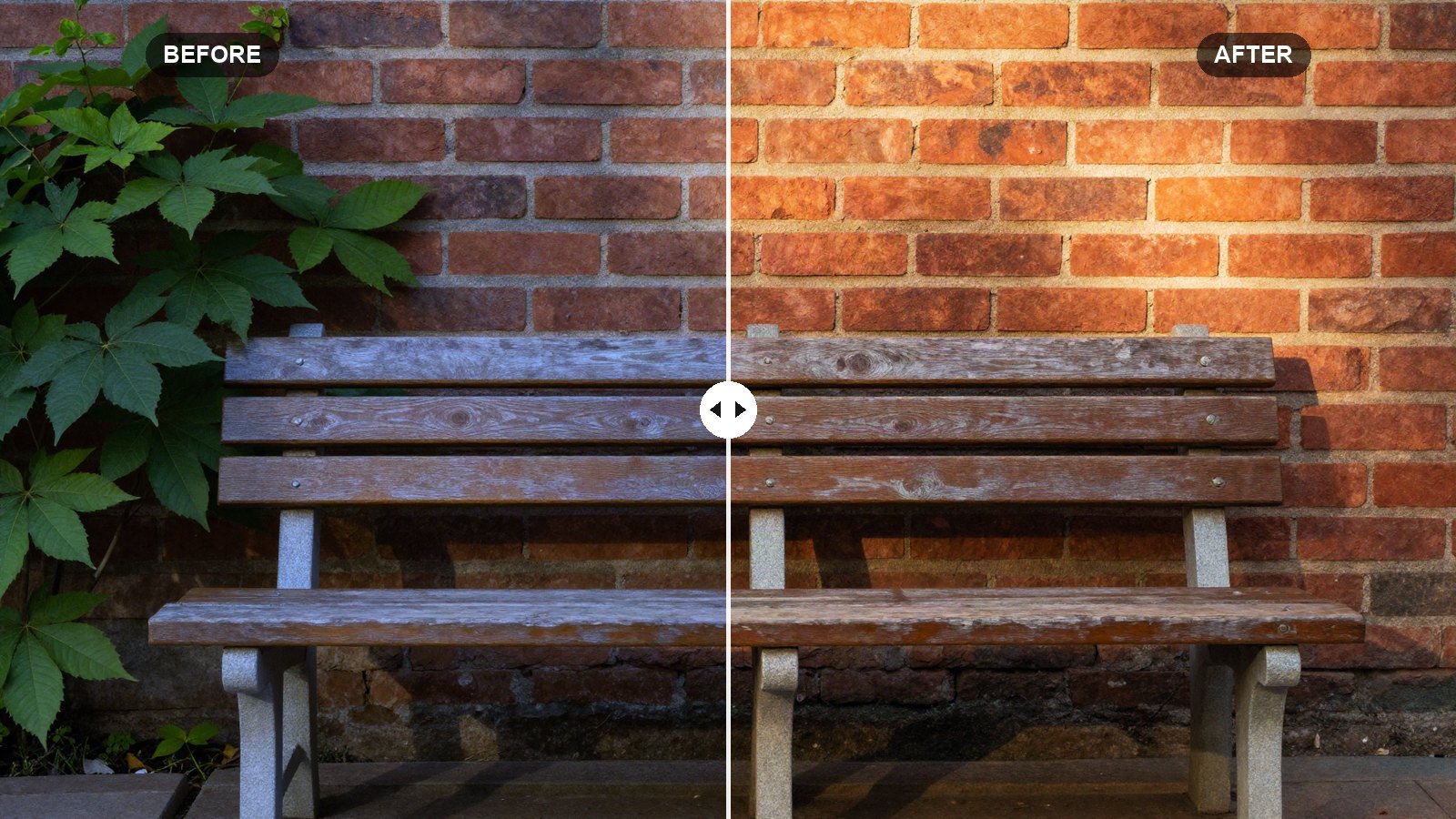
If a preset makes one photo look gorgeous and the next one look orange, white balance is almost always the reason. Every scene has its own light color: blue shade, yellow tungsten bulbs, green-tinted office lights, warm sunset. A preset cannot know which one you shot in, so getting white balance right is the single most useful habit you can build in Lightroom.
This Lightroom white balance guide covers the Temp and Tint sliders, the eyedropper, the built-in presets, why RAW and JPEG behave differently, and what to do when a scene has two kinds of light at once.
Quick answer: White balance in Lightroom is set with two sliders: Temp (blue to yellow) and Tint (green to magenta). The fastest accurate method is the White Balance Selector eyedropper: click something that should be neutral gray or white. You can also choose As Shot, Auto or, for RAW files, presets like Daylight, Cloudy and Tungsten.
On this page
Where white balance lives
- Lightroom Classic: at the top of the Basic panel in the Develop module, labeled WB, with the eyedropper to its left.
- Lightroom desktop: in the Color panel, with a White Balance menu, an eyedropper icon, and the Temp and Tint sliders.
- Lightroom mobile: tap Edit, then Color. The White Balance menu and eyedropper sit at the top of the panel.
Temp and Tint, explained simply
Light color is described on two axes, and Lightroom gives you one slider for each.
Temp runs from blue to yellow. Moving it right makes the photo warmer, moving it left makes it cooler. On a RAW file the slider shows Kelvin values (roughly 2,000 to 50,000), and on a JPEG or other already-processed file it shows a relative scale of -100 to +100.
Tint runs from green to magenta. Moving it right adds magenta, moving it left adds green. It is the slider people forget, and it fixes a lot of problems: fluorescent lights, foliage bouncing green onto skin, and the slight magenta cast some phone cameras produce. Tint runs from -150 to +150.
The Kelvin numbers can feel backwards. Setting Temp to 3,200 K tells Lightroom “the light was warm, like a tungsten bulb”, so it cools the image to compensate. A higher number tells Lightroom the light was cooler, and the photo gets warmer. You do not need to memorize this; just watch the photo as you drag.
Method 1: the eyedropper (most accurate)
The White Balance Selector samples a spot you tell it should be neutral, then sets Temp and Tint so that spot has no color.
- Pick up the eyedropper. Click the eyedropper icon in the WB area. In Classic the shortcut is W.
- Find a neutral target. Look for something that should be light or mid gray: a white shirt in shade, a gray sidewalk, a concrete wall, the white of a printed page. Avoid pure clipped white highlights, because they contain no color information.
- Click it. Lightroom sets Temp and Tint instantly. In Classic a small loupe shows the RGB values under the cursor; when they are close to each other, the spot is neutral.
- Judge the result. If the photo now looks too clinical, nudge Temp a little warmer by eye. Neutral is a starting point, not a rule.
Quick tip: If you shoot a lot in the same light, take one frame of a gray card or a plain white sheet of paper at the start. Click it with the eyedropper, then copy that white balance to every photo from the same setup. It is faster and more consistent than fixing each frame by eye.
Method 2: the white balance presets
The WB menu offers ready-made settings. What you see depends on the file type.
| Option | RAW files | JPEG / HEIC files |
|---|---|---|
| As Shot | The camera’s setting at capture | Available, no change |
| Auto | Lightroom analyzes the photo | Available |
| Daylight, Cloudy, Shade | Available | Not available |
| Tungsten, Fluorescent, Flash | Available | Not available |
| Custom | Appears once you move a slider | Appears once you move a slider |
Auto is better than its reputation. On ordinary daylight scenes it often lands close, and it is a good starting point before you fine-tune. It struggles with scenes dominated by one color, like a forest or a sunset, because it tries to neutralize the very color you wanted.
Daylight is useful when you want to keep the real mood of the light. Golden hour shot on Daylight stays golden. Auto would try to cool it down.
RAW vs JPEG: why it matters here
A RAW file stores the sensor data before white balance is baked in. Changing white balance on a RAW file is essentially the same as changing it in the camera, and it costs you nothing in quality. That is why RAW files get Kelvin values and the full list of presets.
A JPEG or HEIC has already been processed with the camera’s white balance. Lightroom can still shift the colors, but it is working on top of a finished image. Big corrections, like turning a deep orange tungsten shot neutral, can leave skin looking muddy or create blotchy color in the shadows. Small corrections are fine.
If you edit mainly with presets, this is one of the strongest arguments for RAW. Our RAW vs JPEG for presets post explains the other differences and how to shoot RAW on a phone.
Why presets and white balance clash
Many presets include a white balance setting. On RAW files, a preset with Temp set to 5,500 K forces every photo to that value, no matter what light you shot in. On a sunny beach that might be perfect; indoors under warm bulbs the same preset turns everything orange.
Two habits fix this:
- Apply the preset first, then correct white balance. Adjusting WB after the preset keeps the look and fixes the color.
- Leave white balance out of your own presets. When you save a preset, untick the White Balance checkbox. Our free recipe files skip it on purpose for this reason.
White balance is one of six quick fixes we cover in why presets look different on every photo.
Mixed light: when one setting cannot be right
An indoor portrait by a window at dusk has cool blue daylight on one side of the face and warm lamp light on the other. Any single white balance is a compromise: fix one side and the other goes wrong.
Masks solve this. Every mask in Lightroom has its own Temp and Tint sliders, which work as relative adjustments (-100 to +100) on top of the global setting.
- Set global white balance for the most important light. For a portrait that is usually the light on the face.
- Mask the other area. Use a brush, a linear gradient, or an AI mask like Select Background or Select Sky.
- Adjust that mask’s Temp and Tint. Warm a cold window area, or cool down an overly orange lamp glow, until the two areas sit together.
- Feather generously. Mixed light changes gradually, so soft edges look more believable than hard ones.
You do not always need to fix mixed light. A warm lamp in a cool blue room can be the whole point of the photo. Correct it when it looks like a mistake, and keep it when it looks like atmosphere. Our masking guide shows how to build these masks step by step.
Getting white balance right for skin
People notice skin color before anything else. A few checks help:
- Skin should look warm and alive but not orange. If it looks gray or blue, warm up Temp.
- If skin looks slightly green or yellow-green, add a few points of magenta with Tint. This is common under fluorescent lights and in shade near trees.
- If skin looks pink or purple, move Tint toward green.
- Check the whites of the eyes and any white clothing. If they look neutral, the rest usually follows.
Your next edit
Take five photos from different lighting (daylight, shade, indoors, sunset, night) and fix each with the eyedropper, then by eye. You will quickly learn how far you like to move from “neutral”. Once the color base is right, presets behave much more predictably. Next, try our golden hour preset settings and see how a warm look holds up on a correctly balanced photo.
FAQ
What is the best white balance setting in Lightroom?
There is no single best setting. The eyedropper on a neutral gray or white area gives the most accurate result, Auto is a good quick start, and Daylight keeps the natural mood of warm or cool light on RAW files.
Why are Daylight and Tungsten missing from my white balance menu?
Those presets only appear for RAW files. JPEG, HEIC and other processed files show As Shot, Auto and Custom, and their Temp slider uses a -100 to +100 scale instead of Kelvin.
Should presets include white balance?
Usually not. A fixed white balance in a preset looks right only in the light it was designed for. Leaving it out lets you set white balance per photo while keeping the rest of the look.
How do I fix two different light colors in one photo?
Set the global white balance for the main subject, then add a mask over the other area and adjust that mask’s Temp and Tint until both parts look natural together.
Keep reading
How to Create Your Own Lightroom Preset (Step by Step)
Save your own Lightroom presets, choose the right settings to include, and keep a growing collection organized and backed up.
Lightroom Denoise Guide: AI Denoise vs Noise Reduction
When to use AI Denoise, what Amount to pick, why it makes a new DNG, and when manual noise reduction is enough.
Lightroom Tone Curve Guide: S-Curves, Fades and RGB Curves
How Lightroom's Tone Curve really works, with exact points for an S-curve, a matte fade and subtle RGB channel tints.