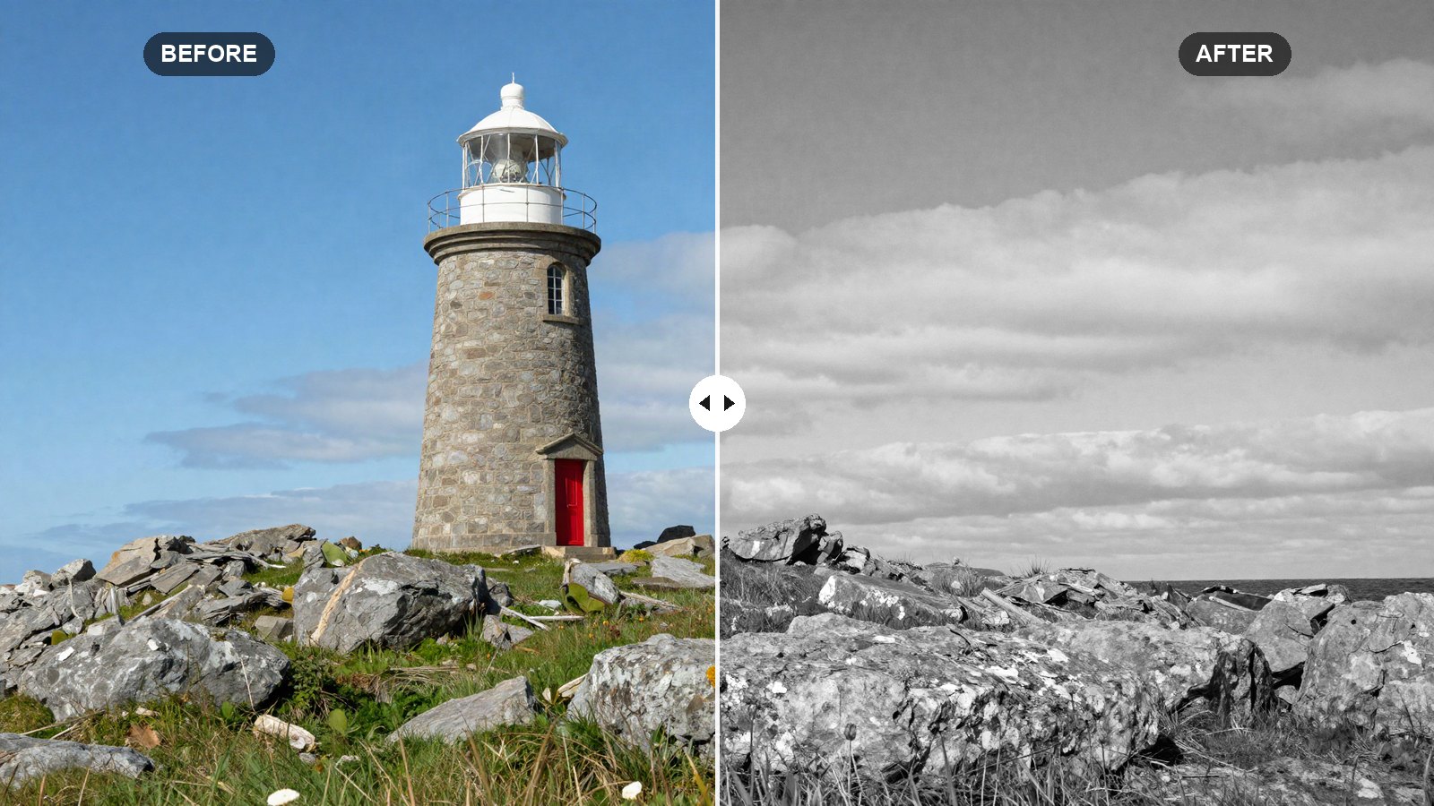
Clicking the B&W button in Lightroom takes one second. Getting a black and white photo that looks rich instead of gray takes a little more. The difference is almost always tonal separation: making sure that colors which looked different in the original, like a red jacket against green grass, still look different once the color is gone.
This post gives you the black and white Lightroom preset settings we use for a rich, contrasty monochrome look, with the reason behind each slider. The values work in Lightroom Classic, Lightroom desktop and Lightroom mobile.
Quick answer: For rich black and white in Lightroom, convert to B&W, add Contrast (+25), set deep Blacks (-25) and bright Whites (+20), add Texture (+12) and Clarity (+15), use a gentle S-curve, then set the B&W Mix: Orange +15 and Yellow +10 to brighten skin, Blue -30 and Aqua -20 to darken skies, Green -15.
On this page
Prefer one click? Download the free preset file at the end of this post.
What makes black and white look rich
A flat black and white photo has most of its tones bunched in the middle grays. A rich one uses the whole range, from true black to clean white, with clear steps in between. Three things get you there:
- A full tonal range. Deep blacks and bright whites give the image weight and sparkle.
- Midtone contrast. Texture and Clarity bring out surfaces like stone, skin, hair and fabric, which carry a B&W photo once color is gone.
- Color-based separation. The B&W Mix controls how bright each original color becomes. That is how you darken a sky or brighten a face without masks.
The recipe works well on street photography, architecture, portraits with side light, dramatic skies and textured subjects. Photos with flat light and little color difference are harder, because there is not much to separate.
How Lightroom converts to black and white
In Lightroom Classic, set Treatment to Black & White at the top of the Basic panel, or press V. In Lightroom desktop and mobile, tap or click the B&W button at the top of the Edit panel. In recent versions this applies the Adobe Monochrome profile, which is a good starting point. Our article on presets vs profiles explains why the profile and the preset are separate steps.
Once the photo is black and white, the color sliders change role. In Classic, the HSL/Color panel becomes the B&W panel, with a Black & White Mix. In Lightroom desktop and mobile, the mixer appears under Color (the label may read B&W Mix, depending on version). Lightroom may also apply an automatic mix when you first convert; the preset’s values replace it.
White balance still matters in black and white
White balance is left out of the recipe and the preset file on purpose. That may sound odd for a photo with no color, but Temp and Tint still change how bright each color is before the mix converts it to gray. A warmer white balance brightens skin and darkens skies; a cooler one does the opposite. Set it per photo, and treat it as a second B&W mix control.
The rich black and white recipe: every setting
In Lightroom Classic, the first two tables are in the Basic panel. In Lightroom desktop and mobile, tone sliders are under Light, and Texture, Clarity and Dehaze are under Effects. Vibrance and Saturation stay at 0, since they have no effect once the photo is black and white.
Light (tone)
| Setting | Value | Why |
|---|---|---|
| Exposure | 0.00 | Set per photo. |
| Contrast | +25 | Spreads tones away from flat middle gray. |
| Highlights | -30 | Keeps detail in skies and bright skin. |
| Shadows | +20 | Keeps detail in dark areas while blacks stay deep. |
| Whites | +20 | Clean, bright white point. |
| Blacks | -25 | Rich, true blacks. |
Presence
| Setting | Value | Why |
|---|---|---|
| Texture | +12 | Brings out fine surface detail. |
| Clarity | +15 | Adds midtone punch, a classic B&W print quality. |
| Dehaze | +5 | Adds a little density to skies and distance. |
| Vibrance | 0 | No effect in black and white. |
| Saturation | 0 | No effect in black and white. |
Tone curve (point curve)
| Setting | Value | Why |
|---|---|---|
| Curve point 1 | Input 0 / Output 5 | A tiny lift so the deepest blacks keep a hint of detail. |
| Curve point 2 | Input 64 / Output 55 | Darkens shadows, the lower half of the S-curve. |
| Curve point 3 | Input 128 / Output 128 | Anchors middle gray. |
| Curve point 4 | Input 192 / Output 205 | Brightens light tones for sparkle. |
| Curve point 5 | Input 255 / Output 255 | Leaves pure white alone. |
In Lightroom Classic, open Tone Curve and switch to Point Curve. In Lightroom desktop and mobile, open Light, then Curve, and choose the white point-curve circle. Drag each point while watching the input and output readout.
B&W Mix
| Setting | Value | Why |
|---|---|---|
| B&W Red | 0 | Neutral; lips and red objects stay mid-gray. |
| B&W Orange | +15 | Brightens skin, the most important slider for portraits. |
| B&W Yellow | +10 | Lifts warm light and sunlit surfaces. |
| B&W Green | -15 | Darkens foliage so it does not compete with the subject. |
| B&W Aqua | -20 | Deepens water and the lower sky. |
| B&W Blue | -30 | Darkens skies so clouds stand out, like a red filter on film. |
| B&W Purple | 0 | Neutral. |
| B&W Magenta | +5 | Slightly lifts pink tones, which helps some skin. |
Effects
| Setting | Value | Why |
|---|---|---|
| Grain Amount | 15 | Fine texture that keeps smooth gradients from looking digital. |
| Grain Size | 20 | Small, tight grain. |
| Grain Roughness | 50 | Default, even grain. |
| Vignette Amount | -15 | Darker edges draw the eye inward. |
| Vignette Midpoint | 50 | Default placement. |
| Vignette Feather | 50 | Default softness. |
Color Grading stays at 0 in this recipe for a neutral black and white. If you like a toned print, adding a warm highlight tint (hue around 40, saturation around 8) gives a soft sepia feel, but that is not part of the preset file.
Tip: Use the Targeted Adjustment Tool on the B&W Mix. In Lightroom Classic, click the small target icon in the B&W panel, then drag up or down directly on the sky or a face in the photo. Lightroom moves the right color sliders for you.
How to apply the recipe
- Open a photo and reset it.
- Set white balance, then convert to black and white.
- Enter the Light and Presence values, then set Exposure for this photo.
- Build the five-point S-curve.
- Enter all eight B&W Mix values.
- Add grain and vignette in Effects.
- Check the blacks and whites for clipping.
- Save as a preset with White Balance unchecked. Our guide to creating your own Lightroom preset covers which boxes to tick.
Adapting the B&W mix to your subject
- Portraits: raise Orange to +25 for brighter, smoother skin, and lower Texture to +5.
- Landscapes with trees: raise Green to +10 if you want bright, glowing foliage instead of dark.
- Dramatic skies: lower Blue to -50. Watch for noise and halos around edges.
- Too harsh: lower Contrast to +10 and Clarity to +5.
- Muddy midtones: raise Whites and drag curve point 4 higher.
For a matching series, apply the preset to a whole set and then sync exposure. Our batch editing guide shows how.
Common black and white mistakes
Converting without adjusting. A one-click conversion usually leaves the photo gray. Contrast and the B&W Mix make it rich.
Too much Clarity on faces. It exaggerates pores and lines. Lower it for portraits.
Pushing Blue too far. Skies past about -60 can show banding and dark halos around buildings.
Your next edit
Start with these values, set white balance per photo, and fine-tune the B&W Mix for each subject. If you prefer some color with the same classic feel, try our vintage film Lightroom preset settings.
FAQ
What are the best black and white Lightroom preset settings?
A strong base is Contrast +25, Blacks -25, Whites +20, Texture +12 and Clarity +15, a gentle S-curve, and a B&W Mix with Orange +15, Yellow +10, Green -15, Aqua -20 and Blue -30.
Does white balance affect black and white photos?
Yes. White balance changes how bright each color is before conversion, so it changes the gray tones. Warmer settings brighten skin and darken skies.
How do I darken the sky in a black and white photo?
Lower Blue and Aqua in the B&W Mix. For more control, add a Select Sky mask and lower Exposure inside it.
Why does my black and white photo look flat?
Its tones are bunched in the middle grays. Add contrast, deepen Blacks, brighten Whites and spread the B&W Mix values further apart.
Download the free preset
LRP Rich BW as an .xmp file for Lightroom Classic, Lightroom desktop and Lightroom mobile. White balance is left out on purpose, so set it per photo.
Not sure how to add it? See desktop install or mobile install.
Keep reading
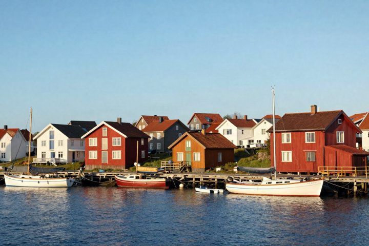
How to Edit Photos With Presets: A Step-by-Step Workflow
The full preset workflow we use on almost every photo, from picking a preset and setting its Amount to masks, finishing touches and export.
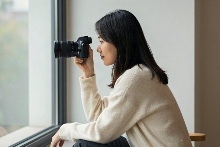
Edit Portraits With Lightroom Presets and Keep Skin Natural
Keep skin natural when you use presets on portraits: white balance, Orange in HSL, People masks, gentle softening and a quieter background.
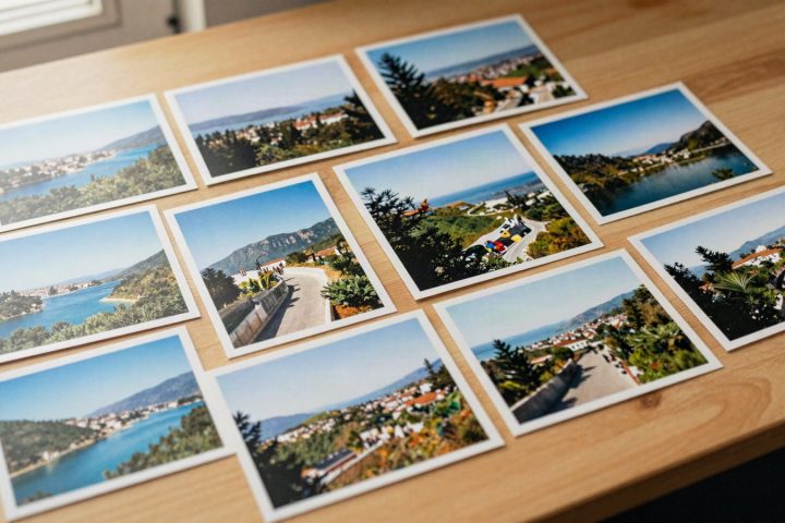
Build Your Own Lightroom Preset Pack: Base Plus Variations
Turn one look into a consistent family: a base preset, small controlled variations, names that sort themselves and a 20-photo test set.